Lightspeed are a B2B and consumer broadband network provider bringing In a new way of wifi.
This was the first brief that I worked on with Flourish Direct Marketing. I was tasked with creating
desktop and mobile landing pages for their new Eero 7 modem provided by Amazon.
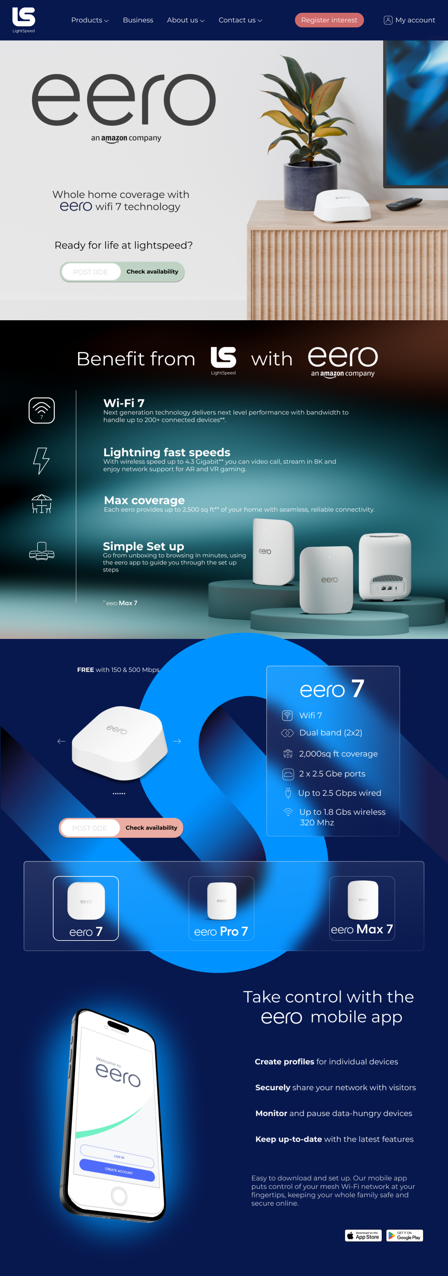
This is the first draft of my landing page. I found it a rewarding challenge to work with two different brand guidelines and cross referencing my ideas with them to see what I could do.
The feedback received was positive and constructive. I had made a good landing page but also lent too far toward the Amazon brand instead of the clients. There were also a few accessibility issues surrounding the glassmorphism used in block 3 ,which I fixed in my second amendment.
In the mobile version of the landing page I centre aligned the text as there is quite a lot of copy for such a small screen. The glassmorphism works well on a small screen and the page flows. I prefer the carousel above the product image rather than to the side with the desktop version.

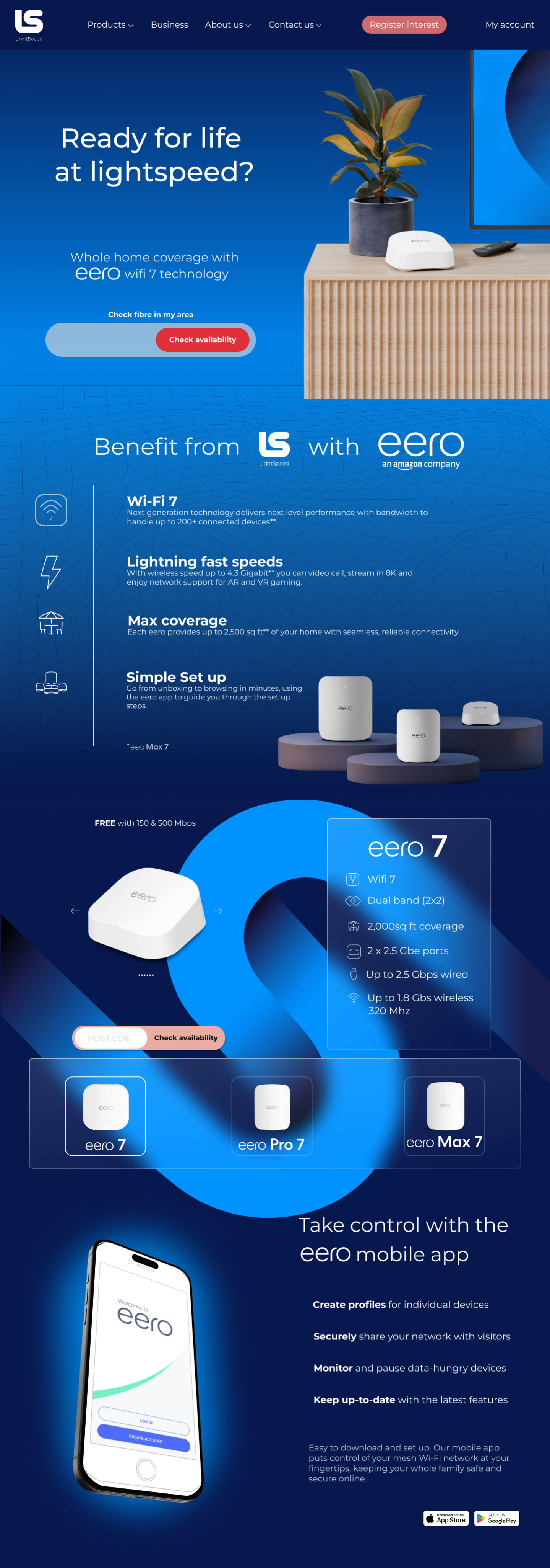
Following feedback from the Senior Designer I implemented a number of changes. I replaced the large Eero text with a tagline provided by the client. The CTA has a deeper red which will improves visual heirachy and the area of interaction is bigger.
In block 2 I added a mesh background to echo the mesh wifi feature that was being advertised. I used a different product photo because the original only featured one model of the modem. I removed the background from this to include some more of the colours included in the brand guidelines.
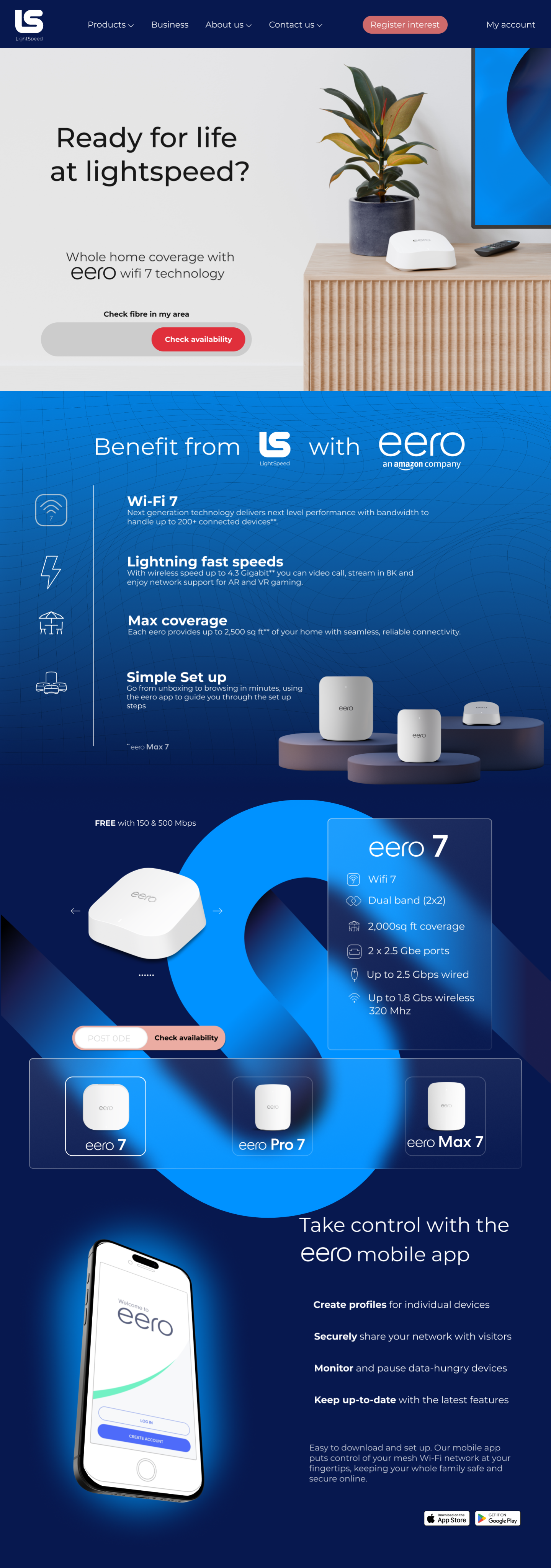
This is another version of the landing page with a different hero image.
In this I removed the background of the image and brought the mesh up from block 2 to create a sense of flow.
In my opinion the background gradient of the whole page flows better and gives a better paralax effect.

Lightspeed are a B2B and consumer broadband network provider bringing In a new way of wifi.
This was the first brief that I worked on with Flourish Direct Marketing. I was tasked with creating
desktop and mobile landing pages for their new Eero 7 modem provided by Amazon.

This is the first draft of my landing page. I found it a rewarding challenge to work with two different brand guidelines and cross referencing my ideas with them to see what I could do.
The feedback received was positive and constructive. I had made a good landing page but also lent too far toward the Amazon brand instead of the clients. There were also a few accessibility issues surrounding the glassmorphism used in block 3 ,which I fixed in my second amendment.
In the mobile version of the landing page I centre aligned the text as there is quite a lot of copy for such a small screen. The glassmorphism works well on a small screen and the page flows. I prefer the carousel above the product image rather than to the side with the desktop version.


Following feedback from the Senior Designer I implemented a number of changes. I replaced the large Eero text with a tagline provided by the client. The CTA has a deeper red which will improves visual heirachy and the area of interaction is bigger.
In block 2 I added a mesh background to echo the mesh wifi feature that was being advertised. I used a different product photo because the original only featured one model of the modem. I removed the background from this to include some more of the colours included in the brand guidelines.
This is another version of the landing page with a different hero image.
In this I removed the background of the image and brought the mesh up from block 2 to create a sense of flow.
In my opinion the background gradient of the whole page flows better and gives a better paralax effect.

Lightspeed are a B2B and consumer broadband network provider bringing In a new way of wifi.
This was the first brief that I worked on with Flourish Direct Marketing. I was tasked with creating
desktop and mobile landing pages for their new Eero 7 modem provided by Amazon.

This is the first draft of my landing page. I found it a rewarding challenge to work with two different brand guidelines and cross referencing my ideas with them to see what I could do.
The feedback received was positive and constructive. I had made a good landing page but also lent too far toward the Amazon brand instead of the clients. There were also a few accessibility issues surrounding the glassmorphism used in block 3, which I fixed in my second amendment.
In the mobile version of the landing page I centre aligned the text as there is quite a lot of copy for such a small screen. The glassmorphism works well on a small screen and the page flows. I prefer the carousel above the product image rather than to the side with the desktop version.


Following feedback from the Senior Designer I implemented a number of changes. I replaced the large Eero text with a tagline provided by the client. The CTA has a deeper red which improves visual hierarchy and the area of interaction is bigger.
In block 2 I added a mesh background to echo the mesh wifi feature that was being advertised. I used a different product photo because the original only featured one model of the modem. I removed the background from this to include some more of the colours included in the brand guidelines.
This is another version of the landing page with a different hero image.
In this I removed the background of the image and brought the mesh up from block 2 to create a sense of flow.
In my opinion the background gradient of the whole page flows better and gives a better parallax effect.
