

Diparé is a brand that I have created for a friends Hydrodipping company. The aim of this brand is to split off from his current style and appeal to a consumer market

The placement of the drip in the logo was a big decision for me as it affects the outcome of how you say the brand.
As the brand is aimed to a more luxury and unique clientele I decided to use the drip as an acute accent on the e which results in the brand being pronounced “DIP-are-AY”
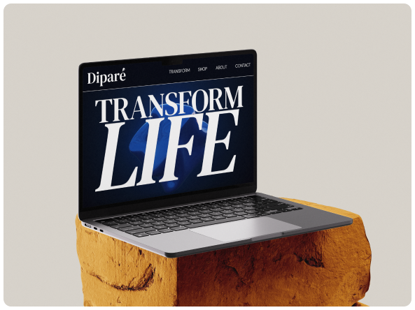
The hero page of the website consists of a 3D graphic of a liquid orb rotating. I used a stock video for this with a gradient to match to the style of the website. I am going to dive deep into Blender and create this myself when I move to publishing the website.
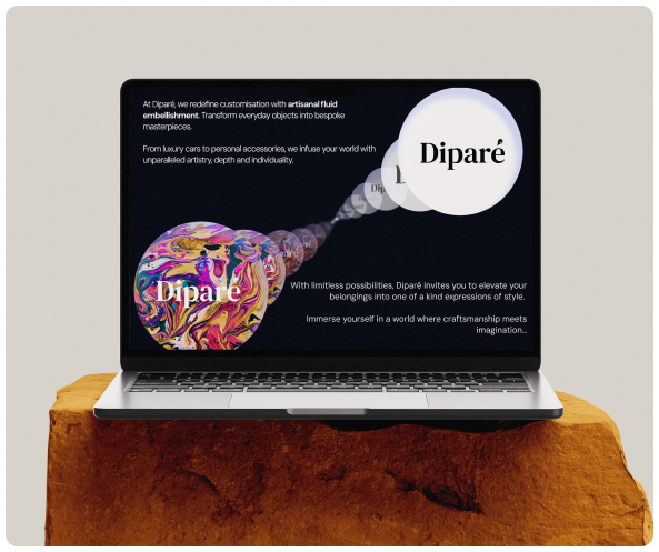
Using a mixture of inside shadows and strokes I created glass globes going from clear to coloured to mimic the process of the service provided by the company. In the copy of the website I have avoided referring to ‘Hydrodipping’.
Instead opting for ‘Artisanal fluid embellishment’
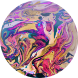
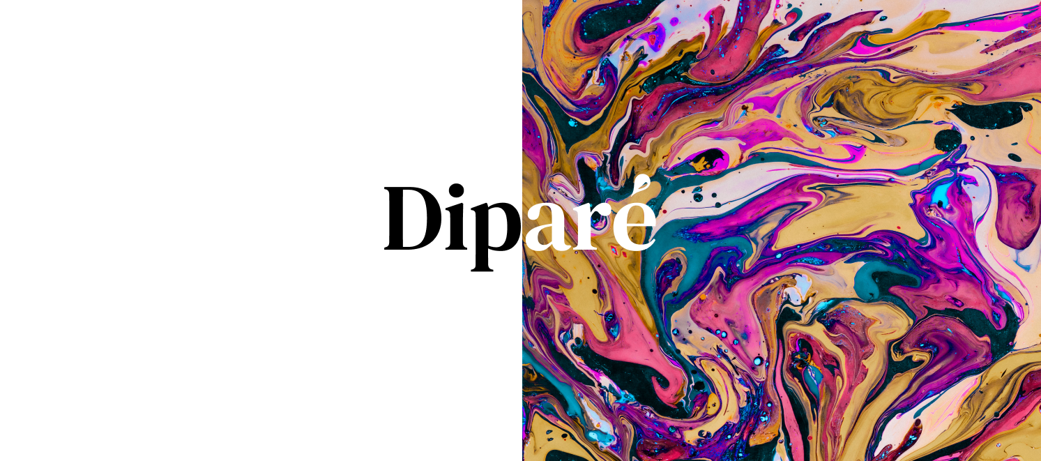
This is the main graphic asset that I have been drawing inspiration from for the smaller assets that back up the brand style
Going forward I will be working with the company to create short form social media content to build a brand personality and extend reach for a stronger customer base.
Get in Touch


Diparé is a brand that I have created for a friends Hydrodipping company. The aim of this brand is to split off from his current style and appeal to a consumer market
The placement of the drip in the logo was a big decision for me as it affects the outcome of how you say the brand.
As the brand is aimed to a more luxury and unique clientele I decided to use the drip as an acute accent on the e which results in the brand being pronounced “DIP-are-AY”
The hero page of the website consists of a 3D graphic of a liquid orb rotating. I used a stock video for this with a gradient to match to the style of the website. I am going to dive deep into Blender and create this myself when I move to publishing the website.
Using a mixture of inside shadows and strokes I created glass globes going from clear to coloured to mimic the process of the service provided by the company. In the copy of the website I have avoided referring to ‘Hydrodipping’.
Instead opting for ‘Artisanal fluid embellishment’
This is the main graphic asset that I have been drawing inspiration from for the smaller assets that back up the brand style
Going forward I will be working with the company to create short form social media content to build a brand personality and extend reach for a stronger customer base.
Get in Touch